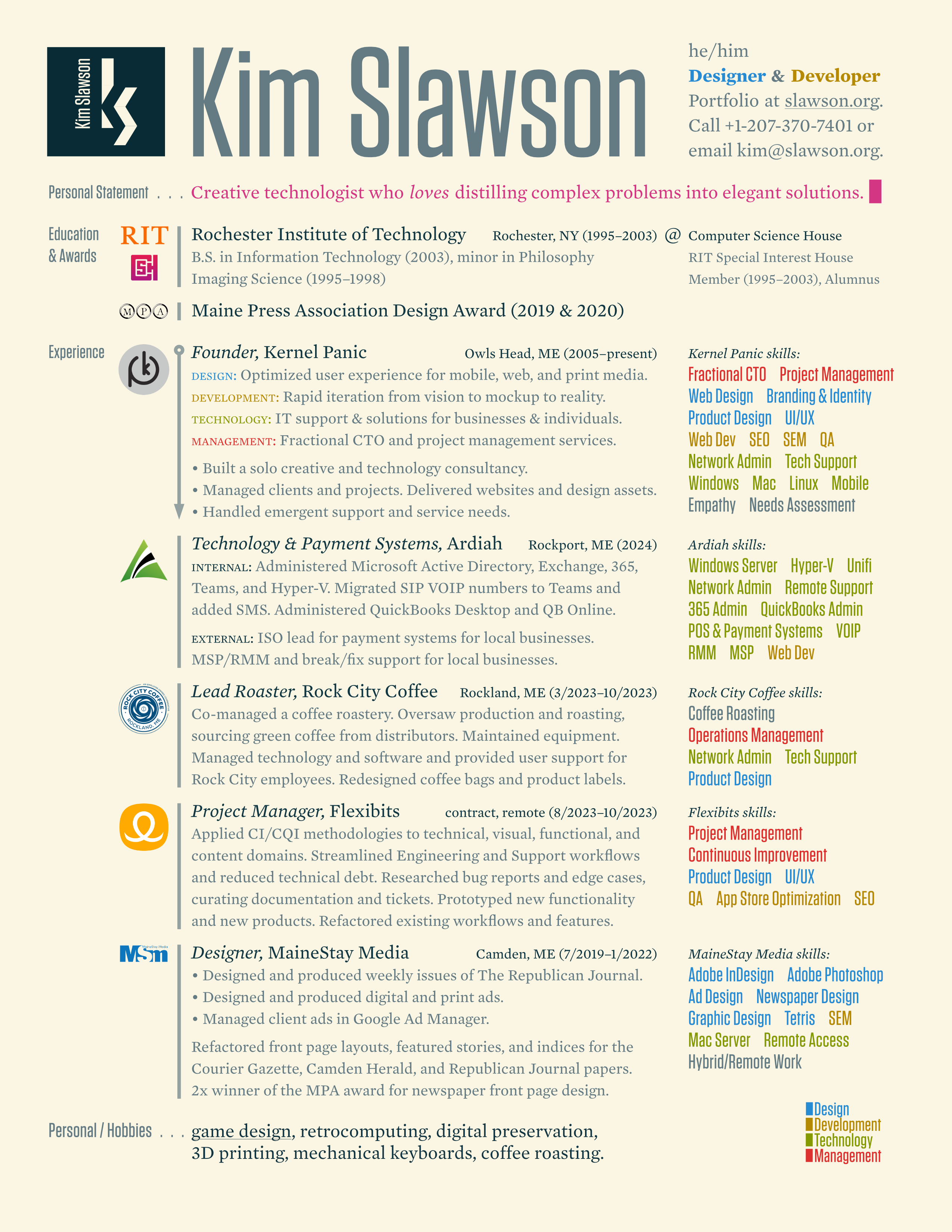
Kim Slawson
Design
Optimized user experience for mobile, web, and print media.
Development
Quickly, accurately iterates from mockup or vision to reality.
Contact Kim to discuss your needs
Profile
A designer and developer proficient in both screen and print media, Kim espouses simplicity and consistency. He speaks for the user, whose needs inform the design and development process from start to finish.
Kim’s work includes websites, product design, print design, logos and branding. He has experience working as a freelancer, with agencies, and directly for his clients. ▌
Strengths
UI/UX design
Kim brings deep, cross-platform expertise in mobile, web, and print design, delivering intuitive, high-impact user experiences tailored to each medium.
Front-end development
HTML, CSS, JavaScript, oh my! Kim is a standards-bearer throughout the whole process. He even dreams in code*. As fun as this sounds (and looks in movies) in real life most of coding is debugging, not exactly the stuff of dreams.
Typography
Typography isn’t just a minor detail of a design, it’s the backbone. Kim sweats the spacing, the rhythm, the weight of every glyph. Bad kerning is a personal affront. Comic Sans? That’s war.
* no, really. He dreamt of vertical floats and combining horizontally-flowed and vertically-aligned elements only to wake up to the reality of poor browser support for layout of CSS-transformed elements.
Portfolio
Selected works including digital design, websites and webapps, print work, and product design.
Colophon
This site was developed in Midcoast Maine with love and care (and plenty of coffee). I couldn’t have done it without the help of the following:
-
Solarized color palette
Precision colors for machines and people. (Thanks, Ethan)
-
Vim
The ubiquitous text editor. (RIP, Bram)
-
CSS Responsive Grid Overlay
A lifesaver for making sure that your columns and baseline grids are laid out properly. Go ahead! Try it for yourself on this site:
Blog
My (very) occasional ramblings.
Filter by tags:
July 2025
-
Lorem Ipsum, Reloaded
What if a young hacker wrote placeholder text?
June 2025
-
New Site, Who Dis?
Same great brand, less jQuery Mobile.
December 2016
-
Shorthand Stack: Font Shorthands for Consistent Metrics in CSS Font Stacks
Prevent layout inconsistencies across typefaces and platforms.
July 2013
-
CSS Clock with Connected Hands
Proof-of-concept clock animated with CSS.
February 2013
-
They Might Be Giants Interview
In which I briefly come out of radio DJ retirement to interview John Flansburgh.
Previously…
Older blog entries are available at the archive
Lorem Ipsum, Reloaded
Tagged:
Imagine a skilled and confident (over-confident, perhaps) hacker of today's generation got tired of stilted placeholder text born in the time of print and written in a dead language. Behold, a new standard corpus for the digital native. Share and enjoy! If you prefer a version without the formatting, get the gist.
Alpha Hustle & Aesthetic Mastery
- Yo, woke up on that mad lit vibe this morning — energy on overload and ready to flex my code like it’s straight fire. No sleep for the legends, I’m out here chasing that next-level drip.
- Deadass, my workflow is a whole mood. I’m grinding with that unapologetic hustle while others are busy scrolling memes. My keyboard clacks like it’s dropping beats, and every line is pure sauce.
- Real talk: my design is peak aesthetic — sleek, savage, and serving looks that are straight-up iconic. If you’re still rocking last-gen styles, you’re catching a vibe check that’s way above your pay grade.
- I’m not just coding; I’m architecting digital dreams. My CSS is on fleek, and my layouts are so fire they’d make even the dopest influencers double-tap IRL. This isn’t basic, this is next-level wizardry.
- No cap, every project is a masterpiece curated with zero tolerance for weak sauce. I’m blending pure artistry with hardcore grind — imagine a canvas where every pixel is a brushstroke of genius.
- I keep it 100, building apps that hit harder than the latest drop. While the squad is busy catching Z’s, I’m out here in the lab perfecting the hustle, stacking code like it's straight cash.
- Flex mode: activated. My repo is a treasure trove of raw talent, each commit screaming authenticity and next-gen vibes. If you’re not riding this wave, you’re just ghostin’ on the real ones.
- For real, my UI is smoother than a fresh pair of kicks and sharper than your best comeback. I’m serving a whole buffet of aesthetics — no bland designs allowed, only the extra and the iconic.
- Staying woke means evolving — my algorithms are as unpredictable as a TikTok trend, yet always on point. I’m flipping the script on what’s possible, leaving the naysayers stuck in yesterday’s clout.
- At the end of the day, I’m out here living that alpha legacy. Not here to play small — my grind is relentless, my passion untamed, and my code? Straight-up legendary. Bet on that.
Nocturnal Rituals & Bug Intimidation
- Woke up at 2:47 AM in a cold sweat because I dreamed of an unoptimized database query. Didn’t go back to sleep. Sleep is for front-end devs who use Wix. I eat 404 errors for breakfast.
- This website loads before you even click the link. It’s already in your brain. I’ve preloaded the entire experience into your subconscious. You will remember this website in your next life.
- I don’t “fix bugs.” Bugs fix themselves when they see my terminal open. They know their days are numbered. One line of my code is worth 10,000 Stack Overflow threads.
- I handwrite my CSS in Notepad with no syntax highlighting. Every semicolon is placed through sheer instinct. My divs align out of fear. The cascade trembles before me.
- Touch grass? I haven’t even touched a mouse since 2019. I navigate purely through Vim shortcuts and divine intervention. My IDE is a black screen with white text. No UI. No distractions. Pure focus.
- I once wrote an entire backend infrastructure while waiting for my coffee to cool down. The coffee was still too hot when I finished. I drank it anyway. Pain is temporary. Efficiency is forever.
- I don’t “push to production.” My code deploys itself. The servers recognize my work and rearrange their bits accordingly. Kubernetes asked me for advice once.
- Dark mode? My entire setup is dark mode. My keyboard has no labels. My monitor emits no light. I code from memory, guided only by the sounds of mechanical key switches and my own intuition.
- My error logs are blank. Not because there are no errors, but because errors are too afraid to show themselves. My commit messages are just timestamps. I never explain myself.
- At the end of the day, I don’t “log off.” I simply disappear into the ether, my presence forever encoded into the repository. I am the runtime environment.
Minimalist Domination & Code Supremacy
- Woke up at 4 AM, stared at the ceiling for 10 minutes, then started grinding. No breakfast, no distractions, just me and the cold glow of the monitor. If the code compiles, I eat. If it doesn’t, I suffer.
- Design? Minimalist. Colors? Black, white, and one shade of red for intimidation. Fonts? Custom-coded to assert dominance. If your website looks like a mobile game ad, we are not the same.
- “Touch grass” they say. I touch HTML, CSS, and JavaScript. My hands stay clean because my code is cleaner. Meanwhile, your website still loads like it’s on dial-up.
- Weak devs Google solutions. I manifest them. Stack Overflow cries when they see my name because I never ask questions, only answer them. Documentation is my bedtime story.
- This site doesn’t just load — it asserts its presence. No unnecessary animations, no excessive padding. Just raw, unfiltered efficiency. If a user doesn’t understand it, that’s a skill issue.
- Dark mode only. White screens are for people who fear the grind. I write code like I’m in a hacker montage from a 2005 action movie — keyboard clacking, screens flashing, no mouse in sight.
- If I see a single Bootstrap template, I start throwing hands. My layouts are handcrafted like an overpriced artisan coffee. Every div is placed with the precision of a Navy SEAL operation.
- Speedruns aren’t just for games. I deploy websites faster than you can say “Agile workflow.” My sprints don’t end in two weeks — they end when the job is done. No meetings, no delays, just results.
- I fear no bug, but that one CSS issue where everything breaks for no reason? It haunts me. I battle it daily, and I will win. Because I am inevitable.
- At the end of the day, the grind doesn’t stop. The code never sleeps. Weak devs log off — I log in. Sigma mindset, zero distractions, only forward. If you’re not built for this, go back to Ohio.
Precision Engineering & Relentless Execution
- Didn’t ask for permission. Just built it. Most people ship features. I architect leverage. The system holds because I wrote it to — every edge case is a closed loop. While others are drafting roadmaps, I’m deploying revolutions.
- You call it polish. I call it discipline. Every animation is hand-tuned, every delay deliberate. Interfaces shouldn’t just work — they should haunt you. I don’t optimize for likes. I optimize for impact.
- No team syncs. No slack threads. Just clarity, caffeine, and a hot reload loop that could melt glass. I debug with instinct and design like I’ve been here before. Because I have. In a dream. Three years ago.
- This isn’t a design system — it’s a weapon. Built modular, deployed mercilessly. Components slot together like clockwork because they were forged, not assembled. Every breakpoint, a calculated threat.
- I don’t brainstorm. I download. The ideas show up fully-formed, like they’ve been waiting. Tools don’t matter. Frameworks don’t matter. I’ll build in Notepad if I have to. You’ll still feel it load before you click.
- Deadlines are for mortals. I ship when it’s done, and it’s always done early. Not because I’m rushing — because I see the shortest path without looking. The backlog clears itself out of respect.
- I test in production. Not by accident — by design. The real world is the only test environment that matters. Uptime isn’t a metric, it’s a promise. And I’ve never broken one.
- Design isn’t taste — it’s foresight. Most people chase trends. I bury them. This layout? It’s already two years ahead. The scroll feels inevitable. The palette tells a story. You’re not navigating a site, you’re following a signal.
- This stack isn’t popular. It’s correct. Built lean, not fragile. Scales without sagging. When something breaks, it’s because I let it. Failure is a feature in my architecture. Nothing teaches faster.
- They told me it couldn’t be done. That’s why it’s already live. I don’t pitch — I publish. I don’t iterate — I execute. If you’re seeing this, it means the build worked. Welcome to the version that was never supposed to exist.
Weaponized Architecture & Battle-Tested Deployment
- The docs were wrong, so I rewrote them in my head. Syntax is muscle memory. Patterns live rent-free. I don’t Google — I grep. Every commit is a bet, and I don’t lose.
- I don’t do sprints — I move at escape velocity. While others estimate, I eliminate. I don’t ask what’s possible. I ask what’s minimal. And then I subtract again.
- Logs are my love language. I see the bug before it happens. Stack traces read like poetry when you know where to look. Most people panic at a red error screen. I see a doorway.
- AI writes boilerplate. I write the parts it can’t understand. Business logic, edge paths, emergent behavior — handcrafted in silence. No shortcuts. Just precision.
- Package managers tremble when I walk in. I don’t trust third-party code — I inspect it. If it has more dependencies than functions, it’s not a library, it’s a liability.
- I don’t chase the new framework of the week. I use what endures. Trends decay. Principles compound. You can find me upstream — making the tools people build tools with.
- My uptime isn’t five nines — it’s binary. Zero or one. If it’s online, it’s working. If it’s not, it’s already being patched. No monitoring alerts. I feel the infra change temperature.
- The UI isn’t clean because of a design system — it’s clean because I respect time. Every user interaction has to earn its click. If it doesn’t serve clarity, it doesn’t survive.
- Scaling isn’t a challenge, it’s a consequence. You build it right once, or you rewrite it forever. I don’t write scalable code. I write code that doesn’t flinch.
- Most devs ship features. I ship force multipliers. Internal tools. Performance layers. Custom compilers when needed. You don’t see my best work — you feel it in how fast everything else moves.
Architectural Purity & Performance Vision
- You don’t need a roadmap. You need a reason. If you’re asking for alignment before committing a line of code, you’re already lost.
- Latency isn't a number. It’s a smell. I can tell if a system’s slow by how the team talks about it. Language reveals performance debt before the profiler does.
- Your backlog is a graveyard. Mine is a todo.txt with five items and no survivors. Features don’t launch when they’re ready. They launch when I say “done.”
- I don’t chase bugs. I set traps. The system should break where I expect it to. If you’re surprised by a crash, it means you weren’t listening.
- Design is not how it looks. It’s how many times I didn’t have to explain it. If you need a tooltip, you already lost the plot.
- Meetings are IO-bound. I’m CPU-bound. If the call doesn’t ship code or kill a blocker, I’m not attending — I’m optimizing.
- Security through obscurity is a myth. But security through obscenely good architecture? That’s real. Attack surfaces shrink when your code stops apologizing for itself.
- Scaling is for cowards. Build lean enough that you don’t have to. Then scale it out of spite when it’s already winning.
- Most people optimize the front page. I optimize the cold start. First impressions matter, but permanence is earned in the margins.
- There’s no such thing as “just tech.” Every line of code is a decision about what kind of future you’re willing to live in. Choose accordingly.
New Site, Who Dis?
Tagged:
Today I’m proud to show off the latest evolution in my personal branding. This site uses the same color palette (Solarized) as the previous jQuery mobile-based site, but besides that it’s brand new. While the old site was mobile-focused, this new site takes advantage of larger screens and also reformats to display well on mobile devices. One thing that hasn't changed since 2013 is my personal brand — why mess with a good thing?
Two great tastes
Previously I struggled to represent the dual nature of my services, half design, half technology. This dichotomy led to me making two separate business cards; the better to serve both types of clientele.
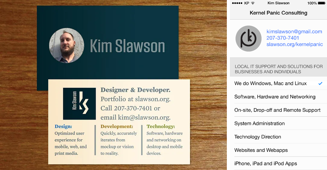
Unfortunately, this extended to two separate but parallel websites, one for each audience. This fragmented digital presence proved fraught to maintain, bad for SEO, and entirely lacking in synergy.

Coincidentia oppositorum
Terence McKenna said, “It’s my assumption, whenever I am confronted with opposites to try to unify them.” I followed the wise words of the bard, and after a few sketches and rounds of prototyping I had something that seemed usable and elegant.
The two sides of my business — facets of my personality — if you will, are stacked like cards on top of each other. Transitions and animations are used sparingly, and to advance to plot, as it were. Scroll-snap helps navigate between sections, whether by swiping, using the arrow keys, clicking on the arrows beside the titles, or clicking on the navigation. Navigation in each domain happens independantly, so if the user isn’t linear and prefers to flip back and forth they can do so without losing their place.
Recent CSS advancements have made the implementation far easier than it would have been when I first envisioned it (thanks, Internet standards bodies!) That said, there’s nothing truly bleeding-edge, so it should render well across browsers and platforms (but please tell me if you find a bug).
Giving credit
I am grateful to those that make the tools and tooling that make development easier, shoutouts in the colophon section.
Maintaining a through-line with the last iteration of this site, I continue to use an old favorite, the Solarized color palette. I’ve kept the colors the same for my site, resume, and business cards: Blue means design, yellow is development, green is technology, and red is management. Recently, browsers and operating systems have begun supporting dark mode. Happily, Solarized ships with dark mode support baked in! Go ahead, choose sides:
Choosing the right type makes a design sing, so I‘m proud to continue using Hoefler&Co’s Mercury Text and Tungsten. Betting on the right horse from the start means never having to rebrand. Thanks, past me 🤝
Baseline, online
An elegant typographic weapon from a more civilized era, the baseline grid helps maintain rhythm and flow on the printed page, and is table stakes in any respectable desktop publishing tool. Not so much on the web, where measures of text and alignment are fluid. There have been attempts to make native baseline grids in CSS, but for now it’s a labor of love, and somewhat of a manual process. I’ve done what I can to ensure that most of the text on the site conforms to a 28px baseline. You can, as the old adage goes “trust, but verify” by turning on the baseline grid overlay.
A stable foundation
It’s my hope that this design and implementation will pay dividends down the line. I look forward to living in this cozy digital home for a long time.
Shorthand Stack: Font Shorthands for Consistent Metrics in CSS Font Stacks
Tagged:
Inconsistent font metrics are the bane of a front-end developer’s attempt to present as uniform as possible an appearance across browsers and platforms. Different fonts can have different metrics that cause unexpected differences in layout and positioning. When matched poorly in CSS font stacks, fallback fonts with metrics sufficiently different from the specified font can cause jumps and realignment as the browser loads the fallback font.
Problem, Solution.
To address all of the above deficiencies in mismatched CSS font stacks I have pinpointed a simple, concise, reliable solution*. It uses repeated declarations of the CSS2 font shorthand property, progressively overriding each other. In contrast to the CSS font stack order of most-preferred to least-preferred, this technique progresses from least-preferred font rule to most-preferred font rule.
Exempli Gratia
A classic CSS font stack is ordered in descending preference, as follows:
font-family: CharisSILW, Georgia, serif;
Let’s see the difference in metrics between these three fonts before compensation:
- serif
- Georgia
- Charis
Checking the fallback fonts in the latest project I was working on, I noticed that Times (the font my system picks for serif) is substantially smaller than either Georgia or the desired Charis. To compensate, I’ve increased the font size to 18px for serif and adjusted the line height proportionately to 1.125em. My shorthand stack technique works as follows:
          font: 18px/1.125em serif;

          font: 16px/1.25em Georgia;

          font: 16px/1.25em CharisSILW;
Note that while Georgia and Charis have similar optical sizes, they have substantially different vertical positions. This technique corrects for both optical size and vertical position by allowing separate combinations of font size and line height per font. After compensation:
- serif
- Georgia
- Charis
Note that while this technique is less elegant than stacks based solely on font-family, it has the advantage of giving added flexibility whilst being almost as concise. Feel free to reach out on Twitter to discuss the #shorthandstack idea, and if you know of prior art, let me know!
What the FOUC?
A related issue, albeit one not covered in the scope of this technique, is the so-called FOUC (Flash Of Unstyled Content) or FOUT (Flash Of Unstyled Text).
* And yes, I know about font-size-adjust, but the browser support is abysmal. It also doesn’t allow changes to line-height or other metrics.
CSS Clock with Connected Hands
Tagged:
The idea came to me to implement a clock with connected hands, rather than the traditional arrangement having the hands pinned at the same point. It occurred to me that I could use CSS transforms and animation to move the hands. Below is a picture of a proof-of-concept that is animated using CSS. It produces neat shapes at certain times, notably equilateral triangles and zig-zags. It works in Firefox but renders more smoothly in Webkit-based browsers like Chrome and Safari.
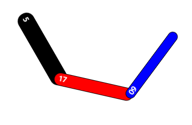
The only Javascript that is used sets the initial position of the hands to the local time and updates the digits once a second, since that can’t (yet) be done in CSS. Check out the fiddle. I’m happy with the result, and even happier that front-end development with HTML/CSS/JS allows prototypes like this to be rapidly constructed and tested.
A complication of the hands being connected is that the clock tends to drift over time proportional to the movement of the hour and minute hand, since the CSS transformation doesn’t take into account the origin of the cascading frames of reference. If it were possible to set the frame of reference for rotation in CSS, this could be avoided. Perhaps in CSS version 4?
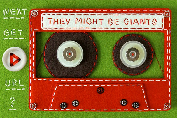
They Might Be Giants Interview
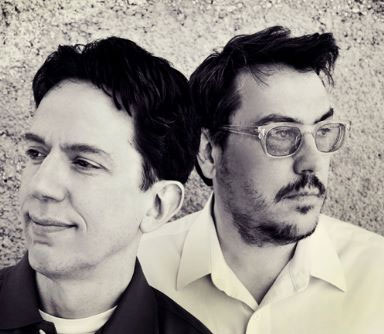
Last week I was honored to interview John Flansburgh of They Might Be Giants. I came out of retirement from being a WRFR volunteer and DJ for one night only and for a good cause. Many thanks to Joelle and Rachel for letting me be a guest host on their show "Jo & Cheech’s Radio Hour" on WRFR. The hour-long interview was split into two parts and broadcast as two separate shows:
- Part 1, 20130219 (1:00:03, 52.2MB MP3)
- Part 2, 20130226 (58:26, 50.4MB MP3)
Notable talking points include:
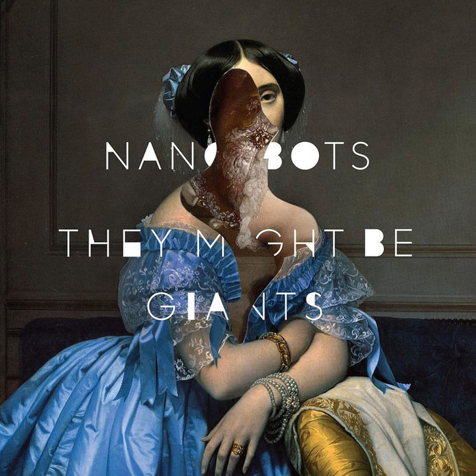
- The upcoming Nanobots EP, out March 5;
- Their worldwide 2013 tour, kicking off in Portland Maine on February 27;
- The new TMBG app for iOS (and soon, Android);
- and much, much more.
I hope you enjoy listening to the show and the interview as much as I enjoyed putting it together.
Games
I run a one-man retro game studio churning out BASIC games for Atari computers for fun and absolutely zero profit.
These games are written in historic and contemporary BASIC dialects (TurboBasic XL and FastBasic), tested in emulation and on real hardware, commented for clarity, and (if being entered into a contest) obfuscated and minimized for brevity.
The ethos driving the development of these little games is "creativity from constraints" — the games may be sizecoded, but (hopefully) they’re still fun.
Give them a try and let me know what you think! If you’re a fellow game developer or retro computing enthusiast, get in touch!
Links
More information about me and my work can be found elsewhere online:
- Github — a developer’s portfolio 👨🏻💻
- Dribbble — a designer’s portfolio 🎨
- LinkedIn — Hire me! 🚀
- Spreadshop — buy my wares 💸
Resume
Contact Kim
If you would like to get in touch to hire me, to discuss a project, or just to say hi, please:
- Call +1-207-370-7401
- Email kim@slawson.org